UI/UX DESIGN > INTERFACE DESIGN > NOSTALGIA
Mac(os)talgia
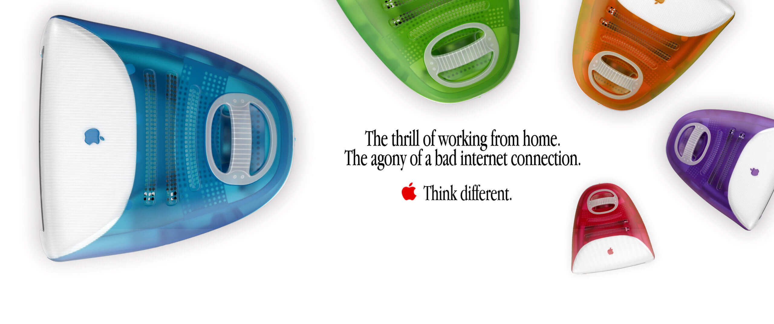
Since COVID-19 hit us by storm, working from home has become the new normal for many, including me. Mac(os)talgia is exploring my 2020 work-from-home routine with an added touch of nostalgia. How would have the same workflow looked like with the tools of today and the limitations of yesterday. Unreliable internet, little disk storage, macOS 9 and much more...
First things first:
Mac OS 9 components
First things first:
Mac OS 9 components
First things first:
Mac OS 9 components
First things first:
Mac OS 9 components
First things first:
Mac OS 9 components
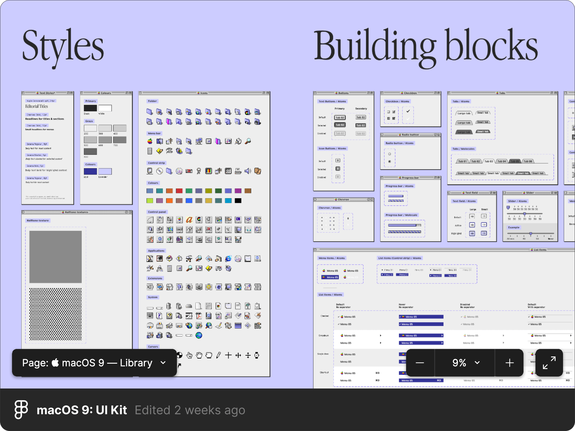
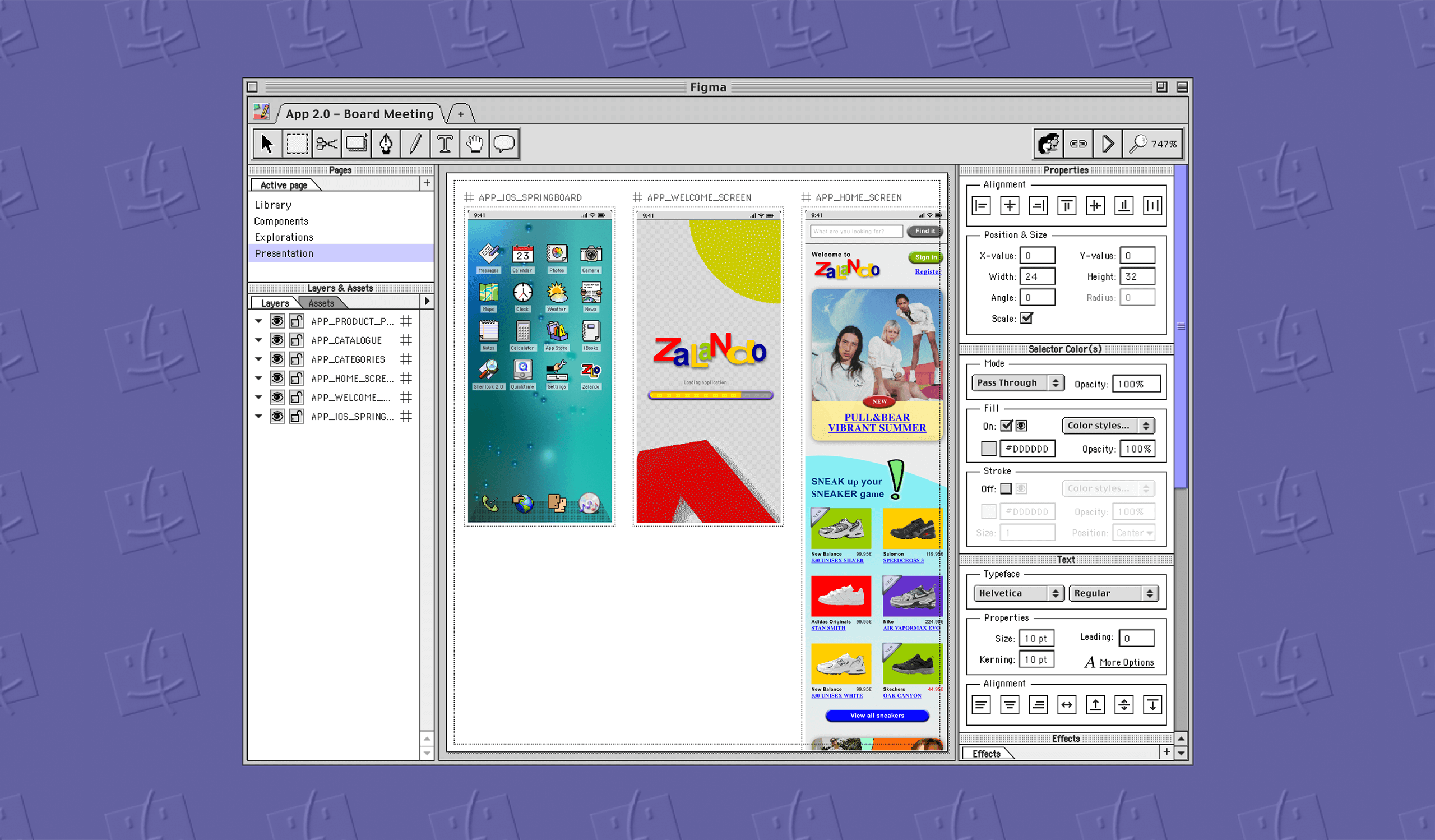
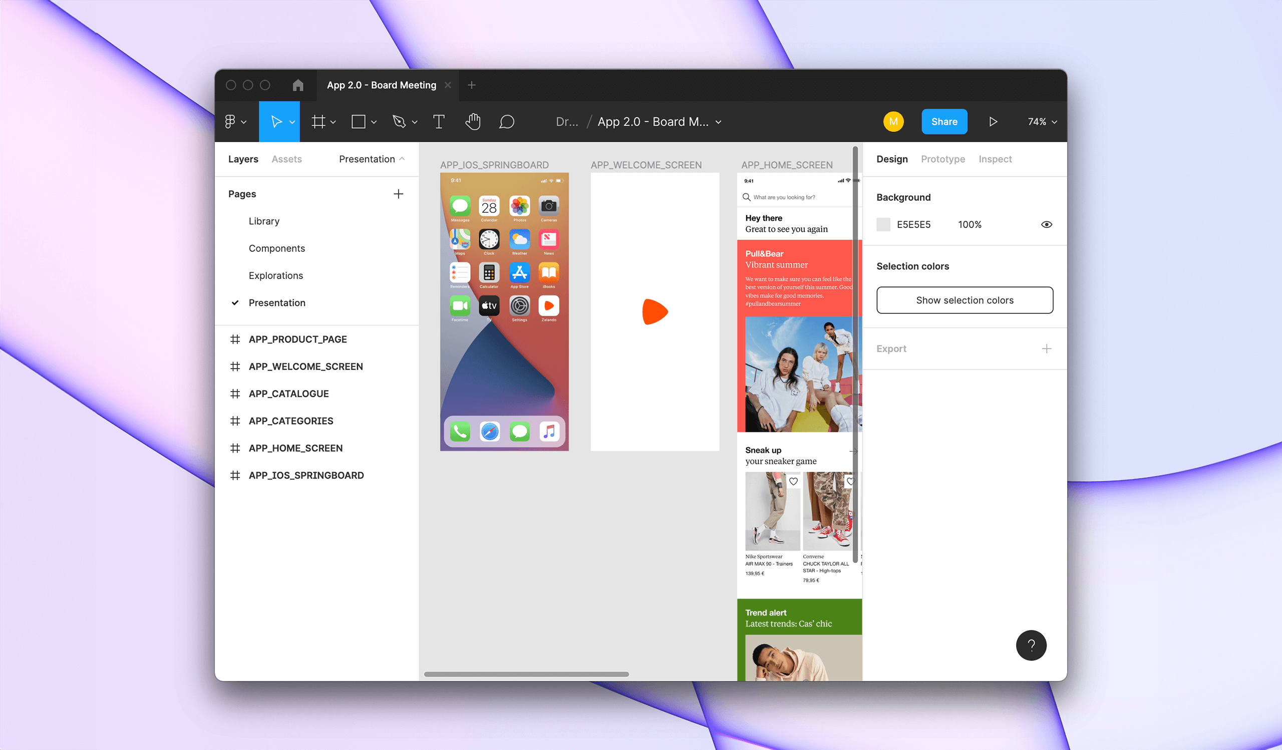
To help me understand how modern applications would have looked liked in the Mac OS 9 era, I had to start analysing the OS in greater detail. After all, the last time I had used Mac OS 9, the word hipster had not even been reappropriated yet. The Mac OS 9 emulator Sheepshaver has been of great help to help me analyse Mac OS 9 in its greatest details.
I then started creating a Library of Mac OS 9 components that I reused throughout my project. The Mac OS 9: UI Kit is available to the whole Figma community. Feel free to use it for your own personal projects as well.
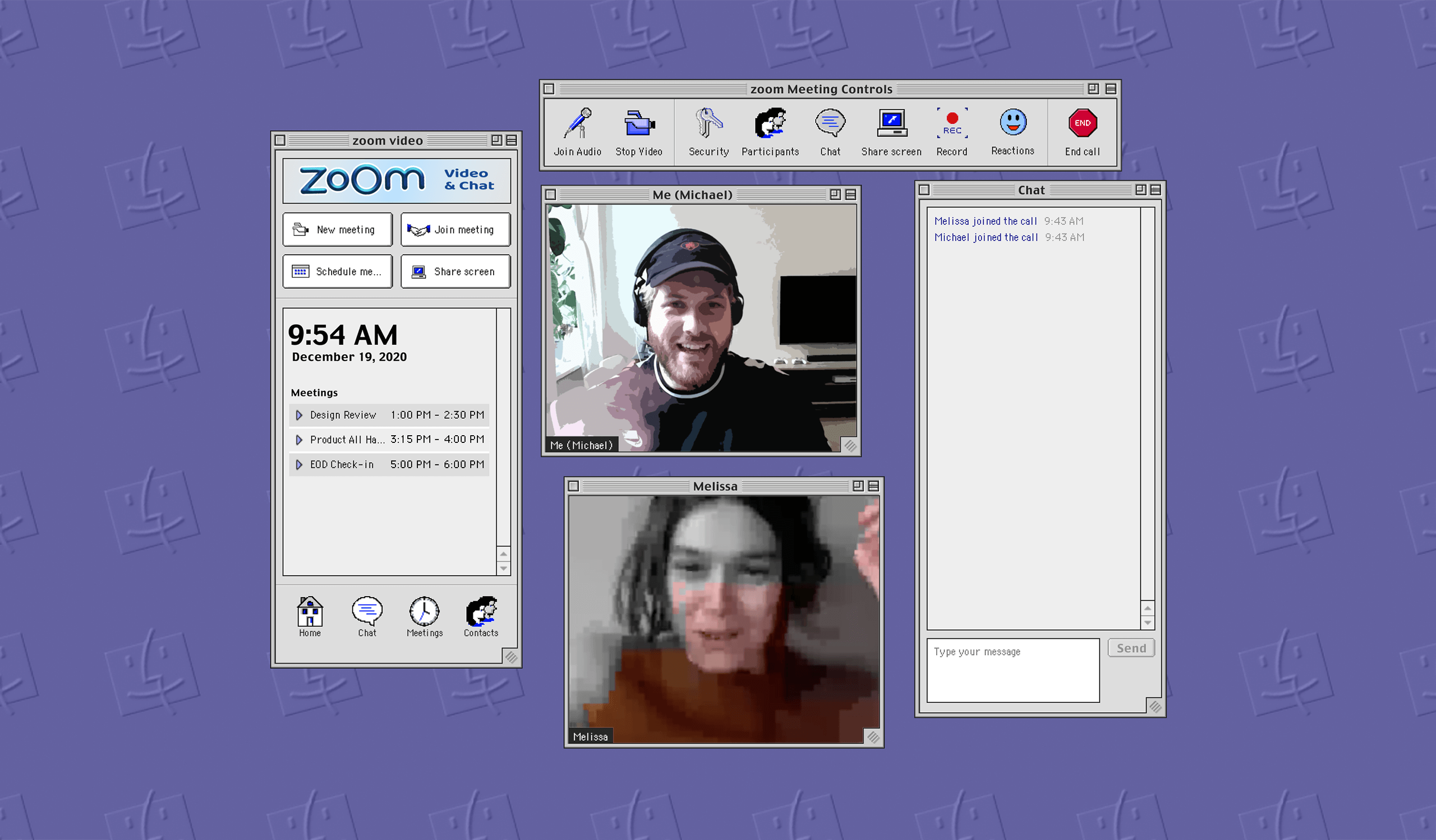
Showtime:
2021 meets Mac OS 9
Showtime:
2021 meets Mac OS 9
Showtime:
2021 meets Mac OS 9
Showtime:
2021 meets Mac OS 9
Showtime:
2021 meets Mac OS 9
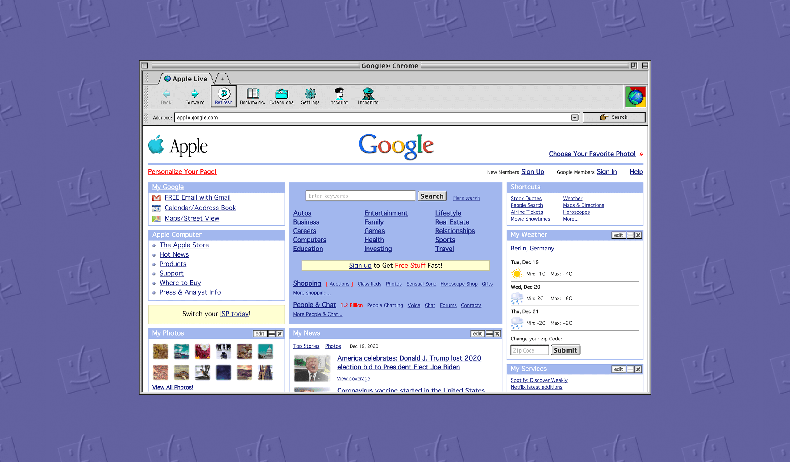
The Mac OS 9 UI Kit I created helped me build a completely reimagined workflow, as if modern day applications had been used on Mac OS 9. Most animations and transitions were completed in After Effects and Premiere Pro.

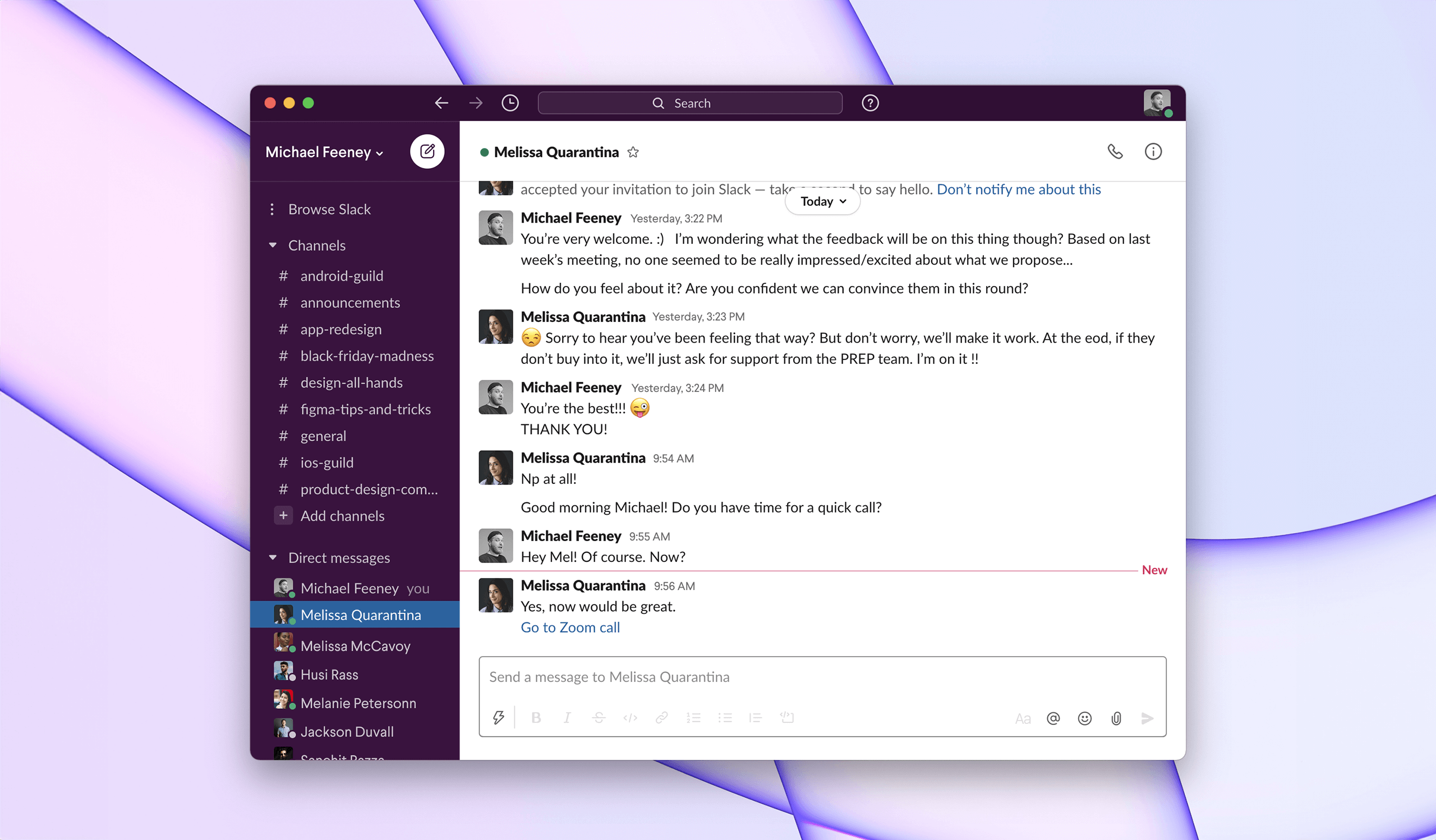
Internet Ready
Internet Ready
Internet Ready
Internet Ready
Mac OS 9 shipped with internet support out of the box: Internet Explorer, Email client and much more made the OS the perfect companion to start browsing the web.
Mac OS 9 shipped with internet support out of the box: Internet Explorer, Email client and much more made the OS the perfect companion to start browsing the web.
Mac OS 9 shipped with internet support out of the box: Internet Explorer, Email client and much more made the OS the perfect companion to start browsing the web.
Mac OS 9 shipped with internet support out of the box: Internet Explorer, Email client and much more made the OS the perfect companion to start browsing the web.
Voice Assistant
Voice Assistant
Voice Assistant
Voice Assistant
Mac OS 9 sort of offered some voice assistance even back in 1999. It offered text-to-speech to make it easier for people with disabilities to use their computer.
Mac OS 9 sort of offered some voice assistance even back in 1999. It offered text-to-speech to make it easier for people with disabilities to use their computer.
Mac OS 9 sort of offered some voice assistance even back in 1999. It offered text-to-speech to make it easier for people with disabilities to use their computer.
Mac OS 9 sort of offered some voice assistance even back in 1999. It offered text-to-speech to make it easier for people with disabilities to use their computer.
Sherlock 2.0
Sherlock 2.0
Sherlock 2.0
Sherlock 2.0
Sherlock 2.0 was the in-built Apple tool that allowed people to search the content or their computer and the web. It is the direct ancestor of the more modern Spotlight.
Sherlock 2.0 was the in-built Apple tool that allowed people to search the content or their computer and the web. It is the direct ancestor of the more modern Spotlight.
Sherlock 2.0 was the in-built Apple tool that allowed people to search the content or their computer and the web. It is the direct ancestor of the more modern Spotlight.
Sherlock 2.0 was the in-built Apple tool that allowed people to search the content or their computer and the web. It is the direct ancestor of the more modern Spotlight.
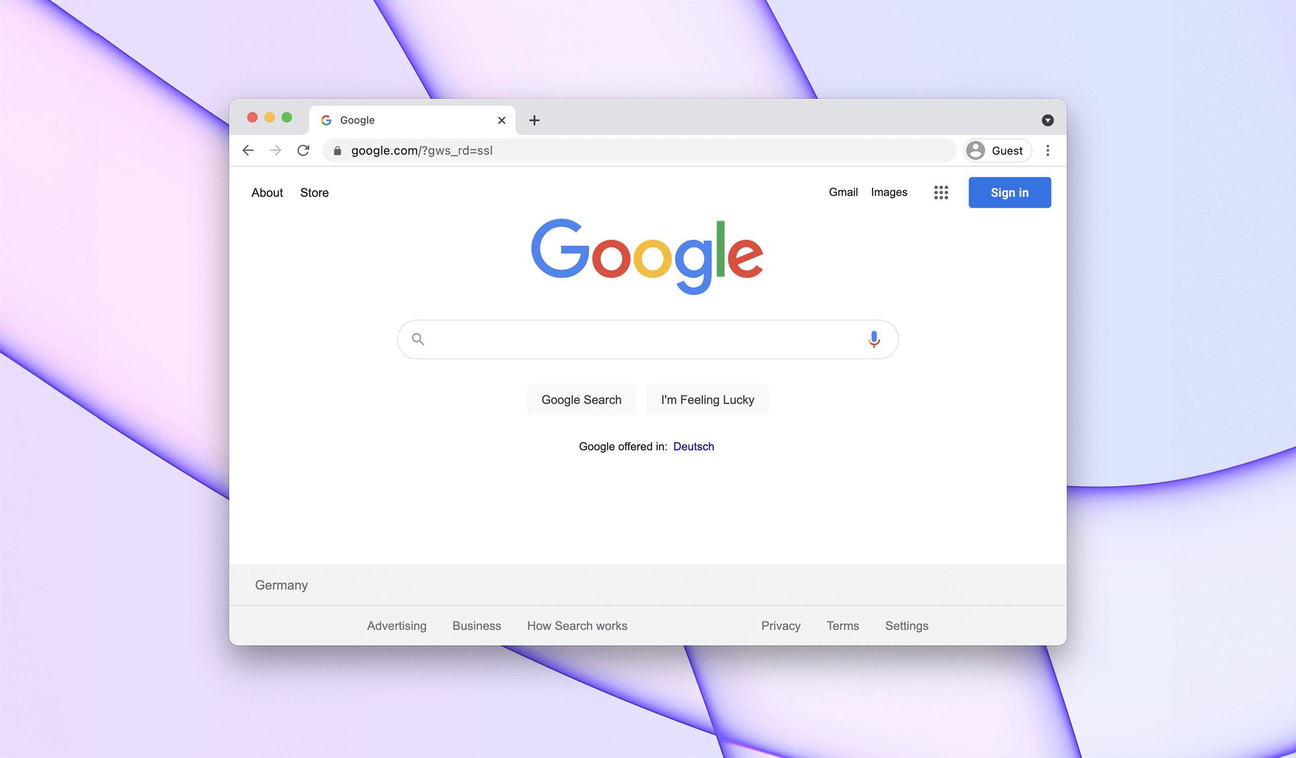
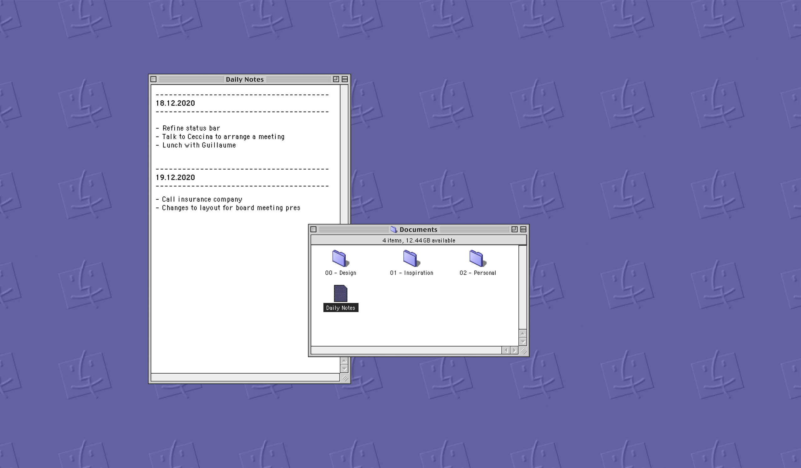
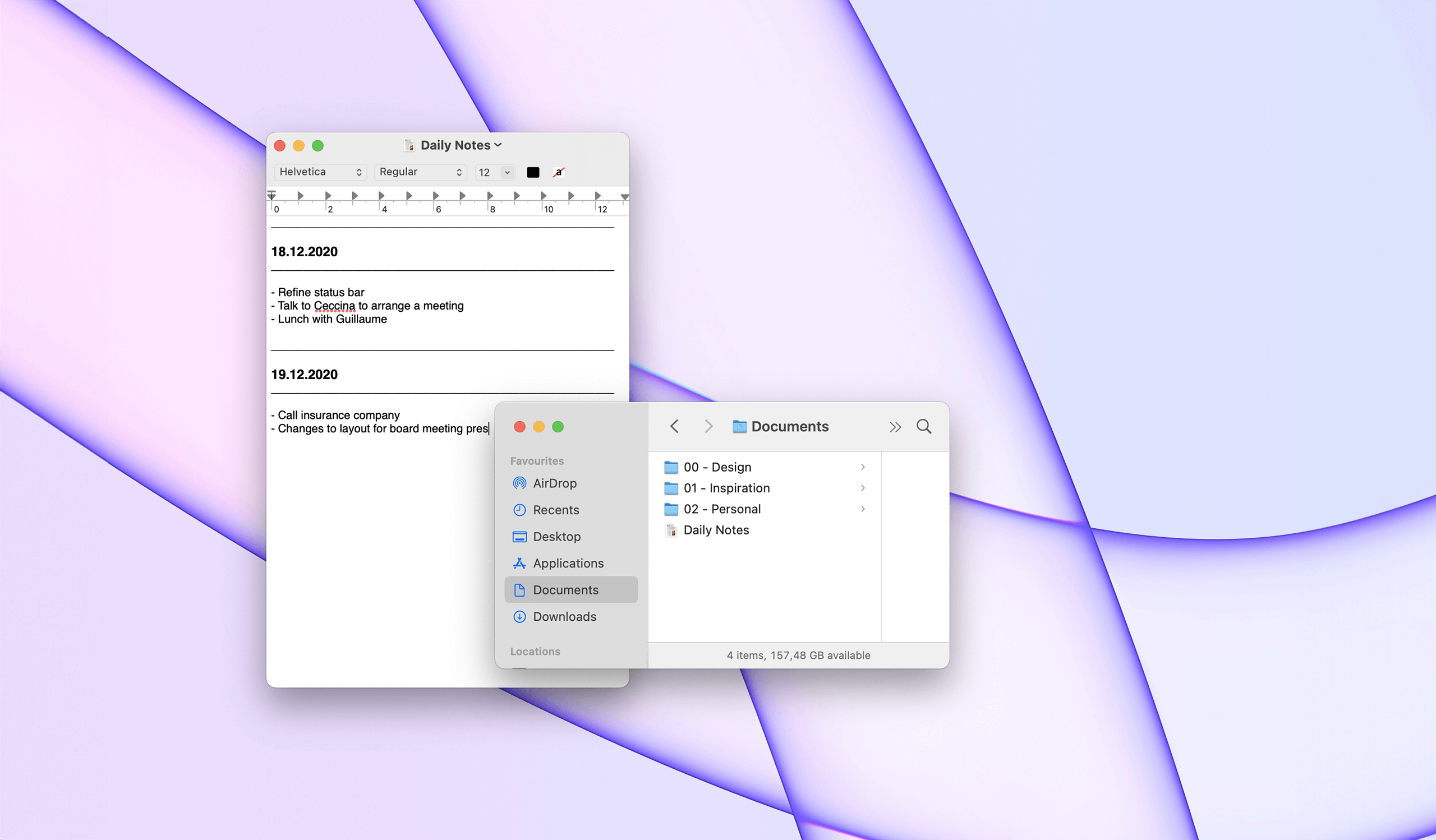
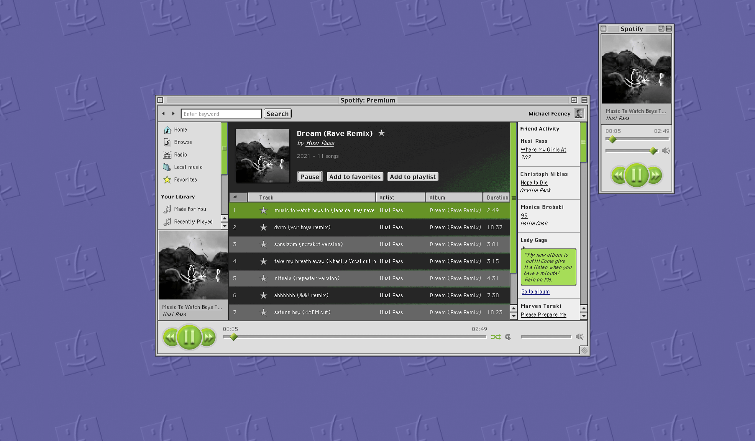
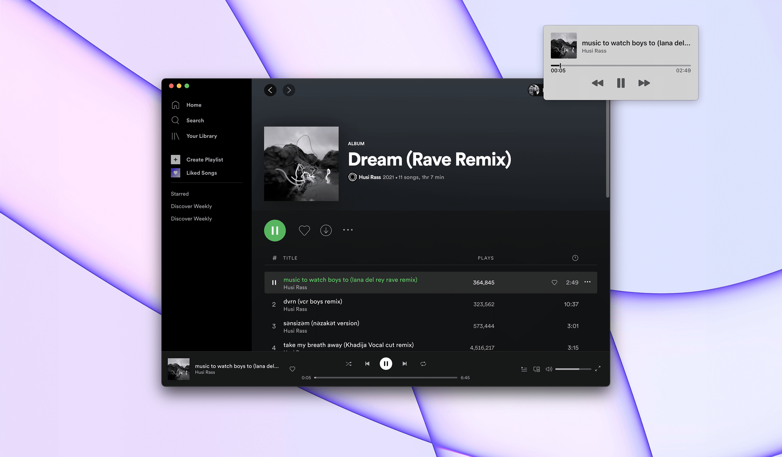
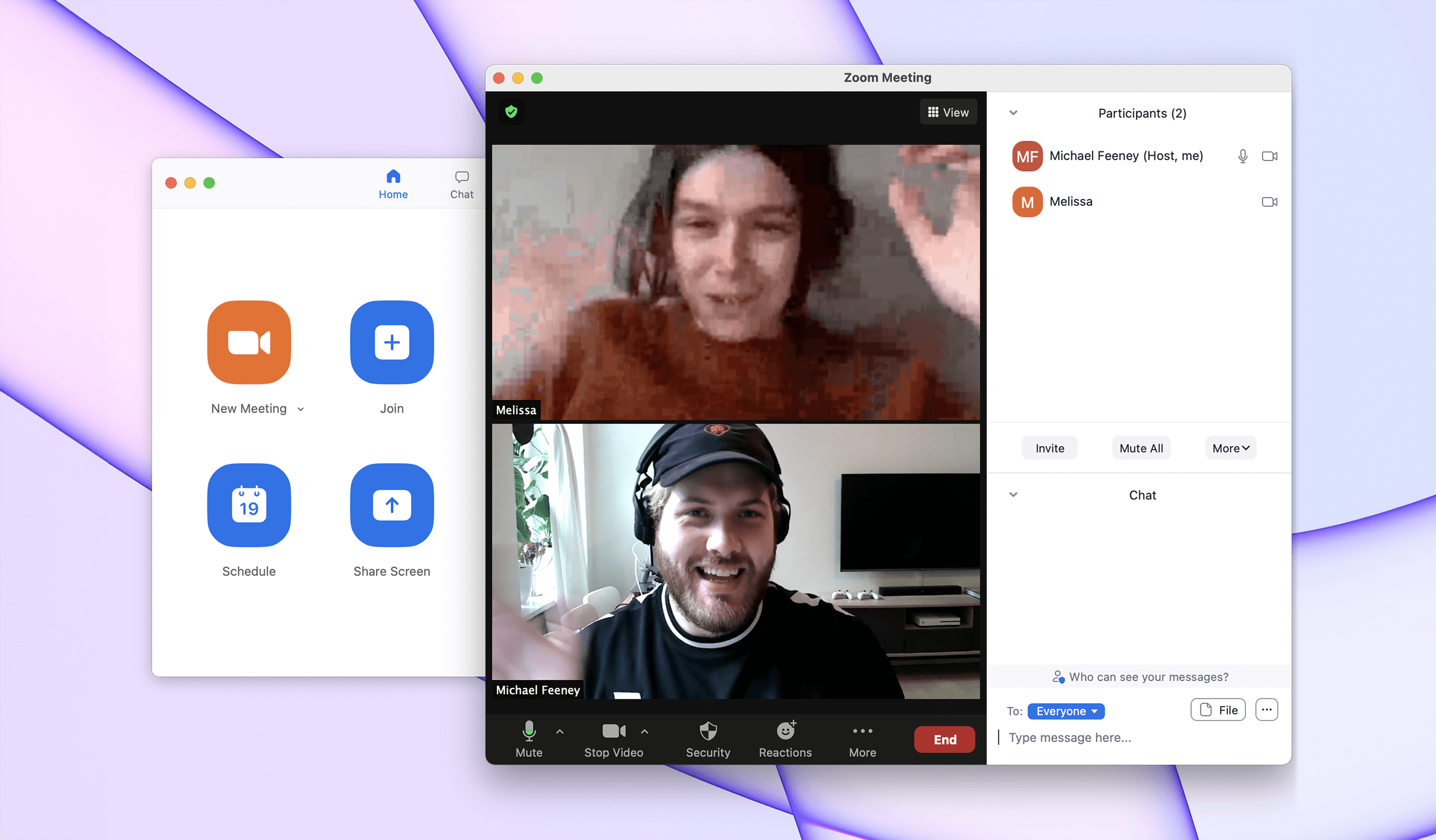
Side by side:
Mac OS 9 <> macOS 11
Side by side:
Mac OS 9 <> macOS 11
Side by side:
Mac OS 9 <> macOS 11
Side by side:
Mac OS 9 <> macOS 11
Side by side:
Mac OS 9 <> macOS 11
Would modern applications look extremely different had they initially been designed for Mac OS 9? Sure, Mac OS 9 had a theme called Platinum, and macOS X+ since moved to Aqua. But other than the theme itself, you might be surprised to see how familiar most apps would still look...

What stood out?
A UI/UX deep dive.
What stood out?
A UI/UX deep dive.
What stood out?
A UI/UX deep dive
What stood out?
A UI/UX deep dive
Even though Design and UI trends definitely changed a lot in the past 20 years, applications still behave and look (somehow, aesthetic aside) very similar. After all, it is indeed difficult to replace well installed behaviour such as visual feedback on hover, scroll for more content, double click to launch application, etc. Basically, because our Operating Systems still behave in a similar way, so did the UI and the UX of many of our apps.
One area where both UI and UX improved dramatically as part of the operating systems is on the accessibility front. The apparition (and improvement) of a full-fletched Voice Control, integrated screen readers, dark mode, etc. is definitely what stood out the most looking back at Mac OS 9.
We really liked the way sans serif typefaces showcase informative and pragmatic content and how serif typefaces bring charm and a human quality to stories. Weighing our options, we realised that we wanted to opt for a serif and sans serif type pairing as our new typography system; something that finally felt like the perfect way to convey Zalando’s personality.
We really liked the way sans serif typefaces showcase informative and pragmatic content and how serif typefaces bring charm and a human quality to stories. Weighing our options, we realised that we wanted to opt for a serif and sans serif type pairing as our new typography system; something that finally felt like the perfect way to convey Zalando’s personality.
We really liked the way sans serif typefaces showcase informative and pragmatic content and how serif typefaces bring charm and a human quality to stories. Weighing our options, we realised that we wanted to opt for a serif and sans serif type pairing as our new typography system; something that finally felt like the perfect way to convey Zalando’s personality.
A lot (and not much)
has changed
A lot (and not much)
has changed
The internet was an absolute pain 20 years ago with 56 kbps connections and hard drives offered very little storage. 20 years later, now that our internet connections can reach the 1 gbps speeds and our hard-drives can store terabytes of data, our internet can still be sucky and we still run out of space. As technology evolved, so did our thirst for getting the best image quality possible on a video call and our desire to store all of our family memories in 4K and High Definition.
Or simply put, as technology improved and adapted to our needs, our tech frustrations moved from 1.0 to 2.0.
Once our direction clearly defined, we had to find the perfect serif and sans serif for our pairing solution. We isolated 140 typefaces from 40 different foundries — ranging from independent studios to renowned foundries. As we wanted to make well-informed and unbiased decisions, we first started by isolating only the typefaces we deemed shared similar qualities. Our next exercise was to look at the technical attributes of the typefaces: languages supported, visual weight, similar x-height, etc.
All options considered, our final pairing solution landed on Helvetica Now — a modern take on our original corporate font, Helvetica — combined with the serif typeface Tiempos.
Credits
This project would've never been possible without precious help and resources. Big thank you to Husi Rass for the soundtrack and Adam0_TS for the iMac G3 Render. All copyrights for the original designs shown above belong to Apple, Spotify, Zoom, Slack, Google Chrome and Figma.